Reinventing The Tattoo Forum
Home » critiques » dragonball tattoo
DragonBall Tattoo
Hey everyone! Here is a fun little piece I did yesterday. It's from a Japanese anima called Dragonball Z. Please let me know what you think. Thanks for looking.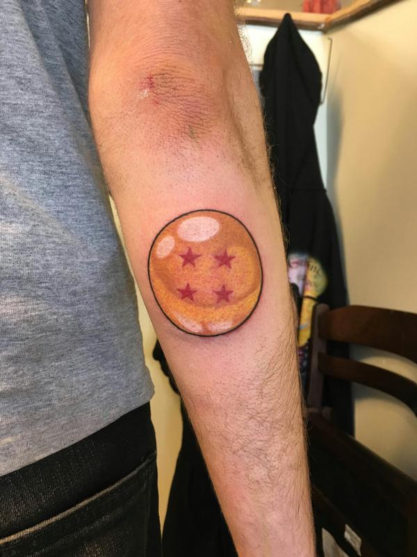
Replies:
DragonBall Tattoo
I think it's a good tattoo. The only thing I would have done differently would be to add darker browns on the top part of the ball where you have the white reflective light to give it a more dynamic lighting effect and give the sphere a little more shape. That's just my thoughts but solid tattoo regardless.
More darker tones
I agree with the above. Some darker tones would give the tattoo more impact, not to mention logevity. I understand you were going for a look closer to the anime, but after a few years the darker tones will help the tattoo's impact as those lighter tones become closer and closer to skintone. It looks super clean though. Though it may not have been your choice, some type of background to help integrate into the skin might've made it a better overall piece, but it's nicely done!
Ryan
Thanks guys
Thanks guys. I have always been a little cautious about going to dark , maybe a little to cautious. I will definitely try going a few values darker from now on. I didn't do a background cause he wanted more of a badge tattoo, but would have loved to add one.
Cheers,
Madison
Thanks guys
Thanks guys. I have always been a little cautious about going to dark , maybe a little to cautious. I will definitely try going a few values darker from now on. I didn't do a background cause he wanted more of a badge tattoo, but would have loved to add one.
Cheers,
Madison
Darker tones
Some darker tones for sure, especially around the highlights which heightens their contrast. I would go one further and throw a dropshadow under the ball to the left, opposite the highlights... A quarter inch gradient from black to mint green, nice and dark up against the outline. Giving the lower edge a neg on pos relationship with the background is a great strategy for popping things foreward.
the stars are immaculate, and the big circle is very clean. It almost looks round, and on the human body, "almost" is about the best you're going to do. For large circular designs I usually look for a way to break the circle with another design element, which distracts the eye away from seeing the lack of perfection in the circle. It's not always possible or appropriate to include an additional element, but it's a good trick to keep in mind.
-
101.07.2020
-
106.02.2018
-
104.18.2018
-
104.17.2018
-
104.17.2018
-
203.19.2018
-
403.19.2018
-
303.19.2018
-
402.12.2018
-
111.23.2017
Need technical support? Call (413) 585-9134 or email